LogoIcon with three horizontal white lines centered on a dark rounded square, symbolizing a menu button.
Bite Buddy app interface on smartphone showing dining style options and favorites in Seattle restaurants.
Multiple angled smartphone screens displaying Bite Buddy app interfaces for dining decisions, including restaurant recommendations, voting options, and detailed restaurant info.
Mobile screen showing a restaurant card for Kizuki Ramen with an image of ramen, tags for price, free parking, vegan, group-friendly, trendy, and an 83% group match, with Vote and See Other Options buttons below.
Bite Buddy: Reducing Group Dining Friction Through User Research
Conceptual Product Redesign
|
UX Research
|
Mobile UX

UX Research

Usability Testing

Decision Support Systems

Social Decision-Making

Concept Validation

Early-Stage Product Design

Bite Buddy is a mobile decision-support concept that helps groups choose where to eat by accounting for preferences, budgets, and dietary constraints. The project began as a team-based concept and was later revisited as an individual usability research effort. Through multiple studies, I evaluated the original experience, identified breakdowns in clarity and trust, and redesigned the product into a research-informed prototype focused on transparency and ease of decision-making.
Timeline:
November 2024
1 Month
Role:
End-to-End Product Design(Research → Synthesis → Prototyping)
Team:
Solo Designer (redesign); originally team-based concept
Tools:
Figma, FigJam
OVERVIEW
Why Choosing Where to Eat Is Harder Than It Sounds
Choosing where to eat with a group feels like it should be simple. In reality, it often turns into a loop of mixed preferences, budgets, dietary needs, and the quiet anxiety of being the person who makes the final call.
This friction shows up most in social settings, where no one wants to dominate the decision but everyone wants to feel considered.
Five people sitting with smartphones at a table, expressing indecision about food with speech bubbles saying, 'I'm broke,' 'I don't care, whatever,' '...,' 'No idea,' and 'I'm vegan,' with food icons above.
Problem Statement
Groups, particularly younger users, struggle to confidently decide where to eat due to conflicting preferences, unclear decision ownership, and decision fatigue.
EARLY EXPLORATION
When the Problem Was Questioned
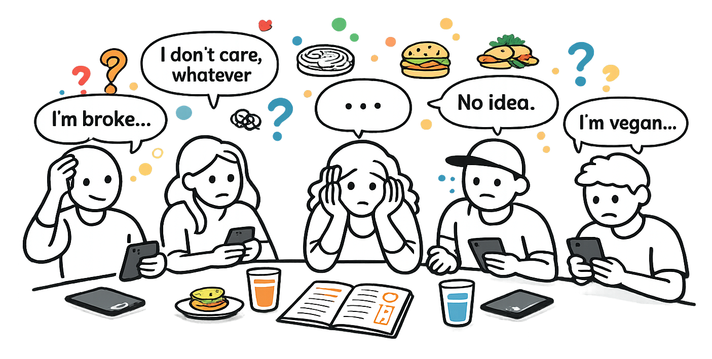
When Bite Buddy was first proposed, there was pushback on whether this problem actually existed. The assumption was that choosing where to eat was a minor inconvenience rather than a meaningful source of friction.
At the time, formal concept validation was not possible. Instead, we spoke with friends, classmates, and peers. These conversations consistently surfaced stories of indecision and frustration, especially among teenagers and people in their early to mid adulthood. This helped narrow our focus to users who regularly make social, group based decisions.
Early Concept Work
Early design work focused on exploring how a structured decision flow might reduce group friction. At this point in my UX journey, the emphasis was on communicating the idea rather than refining visual polish.
Much of this work took the form of pitch boards, diagrams, and early concept screens, which helped clarify the problem and communicate the concept to others.
Black presentation board titled 'Creative Hive' displaying several handwritten notes and sticky notes in various colors.Creative Hive project board showing problem statement, scenario, storyboard sketches, and mobile app wireframes for BiteBuddy, a conversational AI app to help groups decide where to eat.
EARLY EXPLORATION
Reopening the Project Through Research
Later, Bite Buddy was revisited as part of a usability study. Rather than refining the concept further, the goal shifted to understanding how users actually navigated the experience and where confusion or hesitation occurred.Feedback came from three groups:
This reframing turned Bite Buddy from a concept exercise into a research problem.
Study Setup
Using printed screens helped keep the focus on user understanding and behavior rather than visual polish.
I conducted usability testing with four participants using printed screens. Participants were asked to complete a core task while I observed task success, difficulty, and self-reported confidence.
A hand touches a paper showing three smartphone wireframe screens for an app named Bite Buddy, featuring a 'Start a Decision' button, plan input form, and price range slider.Seven printed wireframe sketches of a mobile app named Bite Buddy laid out on a wooden table, showing screens for planning meals, answering questions, loading results, restaurant suggestions, navigation map, and visit feedback, with a hand pointing at the 'Next' button on the food restrictions screen.
Key Observations
Reoccurring Pain Points
All participants encountered similar issues at key moments in the flow. Confusing iconography, unclear selection states, and missing signifiers made it difficult for users to confidently move forward.
Navigation and Mental Models
Two participants noted that the interface reminded them of Netflix. This raised an important question about what differentiated Bite Buddy from simply searching for restaurants online. The presence of a search bar, in particular, felt unnecessary for users who were already unsure of what they wanted.
Lack of Direction and Feedback
Several moments in the experience left users unsure of what was happening or what was expected next. Screens that limited user options or failed to show system status increased confusion and the risk of task abandonment.
Defining Success
Based on these findings, success for a redesigned experience was defined by fewer user errors, higher task completion, and increased user confidence during decision making.
REDESIGN
Why a Larger Redesign Was Needed
The issues uncovered were not isolated UI problems. They pointed to deeper gaps in information hierarchy, flow structure, and system feedback. Addressing them required a broader architectural rethink rather than incremental tweaks.
Research became the foundation for rethinking the experience as a whole.
Redesigning the Experience
Early design work focused on exploring how a structured decision flow might reduce group friction. At this point in my UX journey, the emphasis was on communicating the idea rather than refining visual polish.
The redesign process began with wireframes and progressed into a high fidelity prototype. Design decisions focused on transparency, reduced cognitive load, and clearer system feedback, each grounded in user observations.
Two smartphone screens displaying a survey app; the left screen asks for a price range with a sliding scale from $ to $$$, and the right screen shows a question with multiple-choice options about meal spending with buttons for Back and Next.
The Final Prototype
The final prototype guides users through group decision making with greater clarity and confidence. By making decision logic more visible and reducing unnecessary friction, the experience helps groups move from indecision to agreement more smoothly.
It does not promise the perfect restaurant. It simply makes deciding easier.
A sequence of eight smartphone screens showing the Bite Buddy app interface for group dining decisions, including browsing favorites, event setup, travel time, dining style, dietary preferences, dining recommendations, and a restaurant details with map location.
Reflection and Growth
Revisiting Bite Buddy forced me to acknowledge my growth as a UX designer. Seeing earlier work through a research lens was both surprising and motivating. It highlighted how much my thinking and execution had evolved, while also inspiring me to continue growing.
This project reinforced the value of user feedback and the importance of designing with humility, curiosity, and iteration.