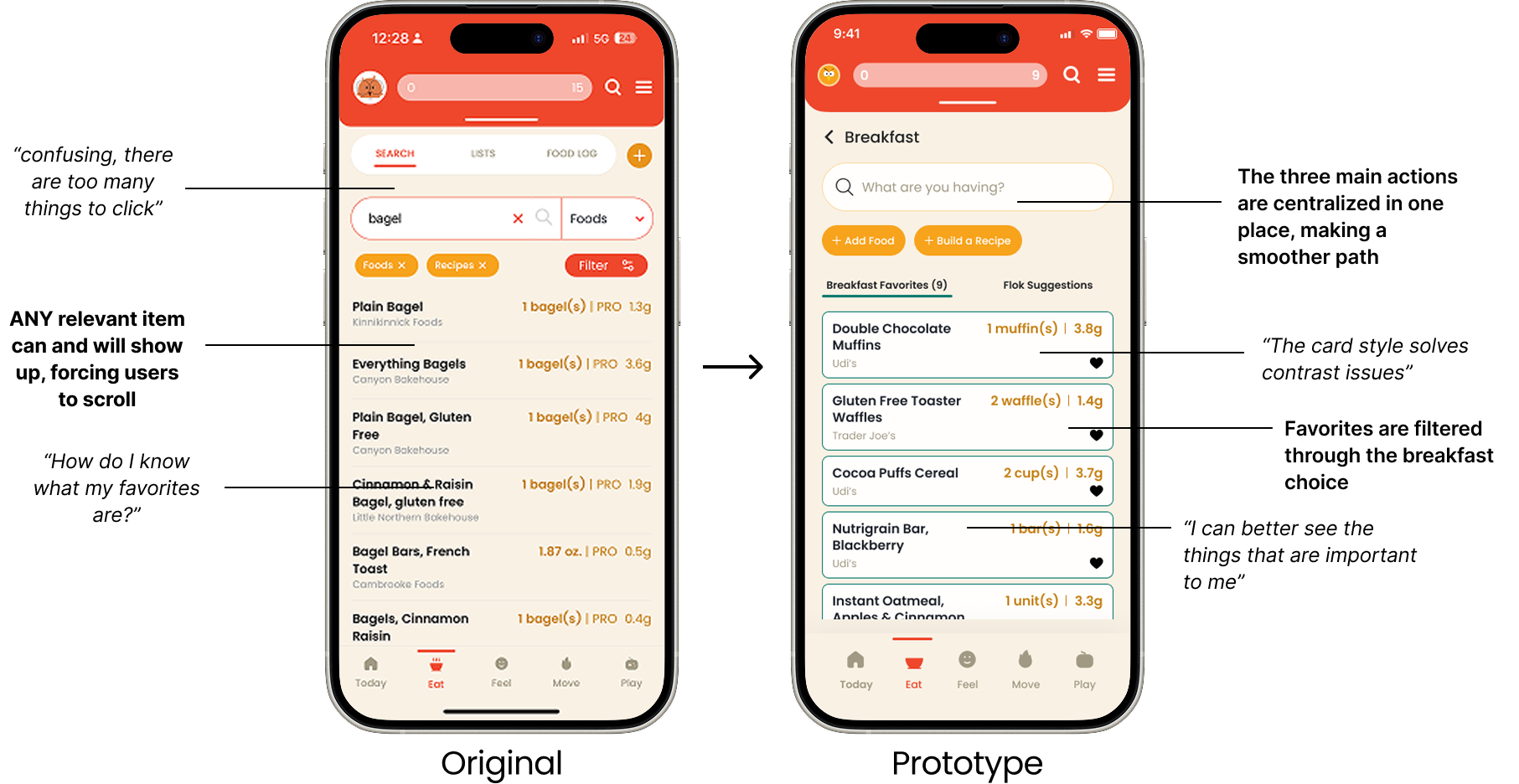
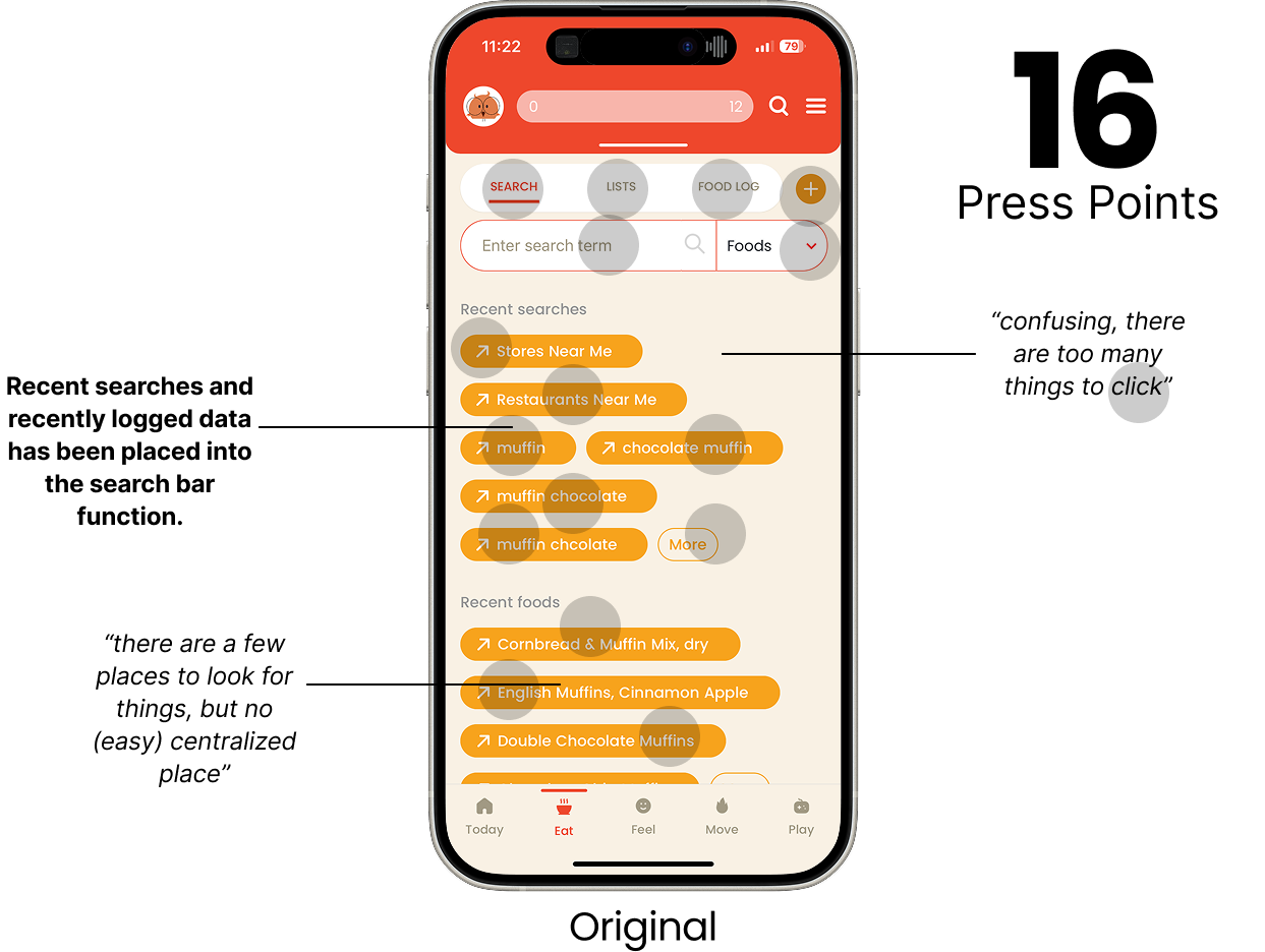
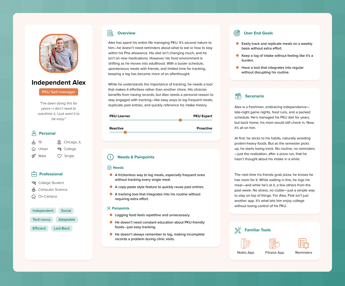
During an early walkthrough, a PKU user summarized the experience clearly.
“There are too many things to press. I do not know what I am doing.”
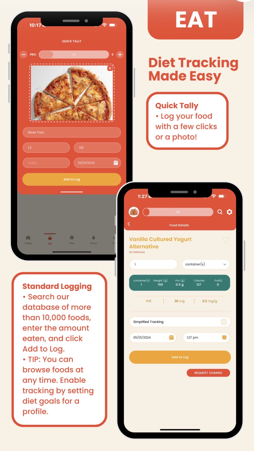
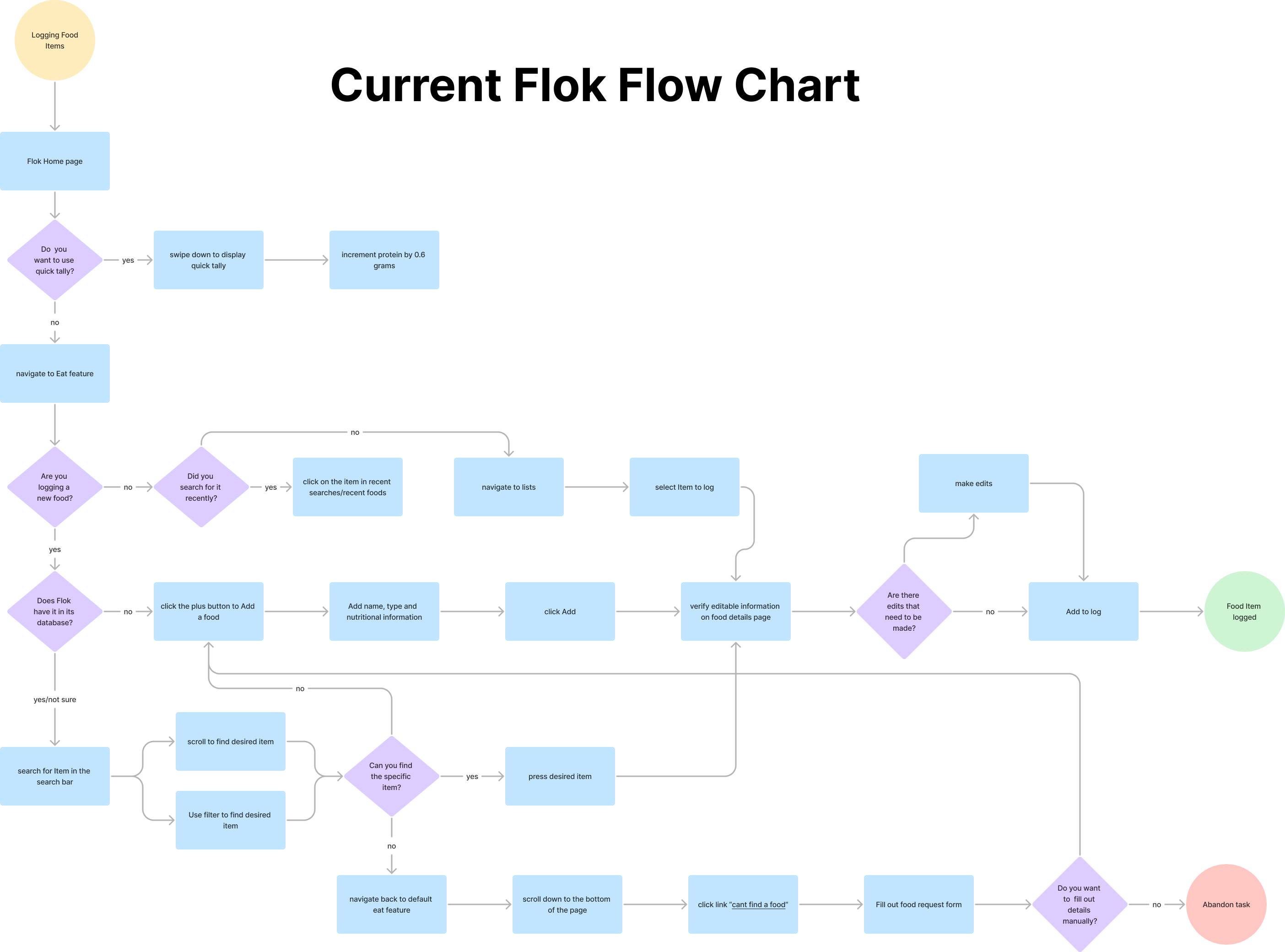
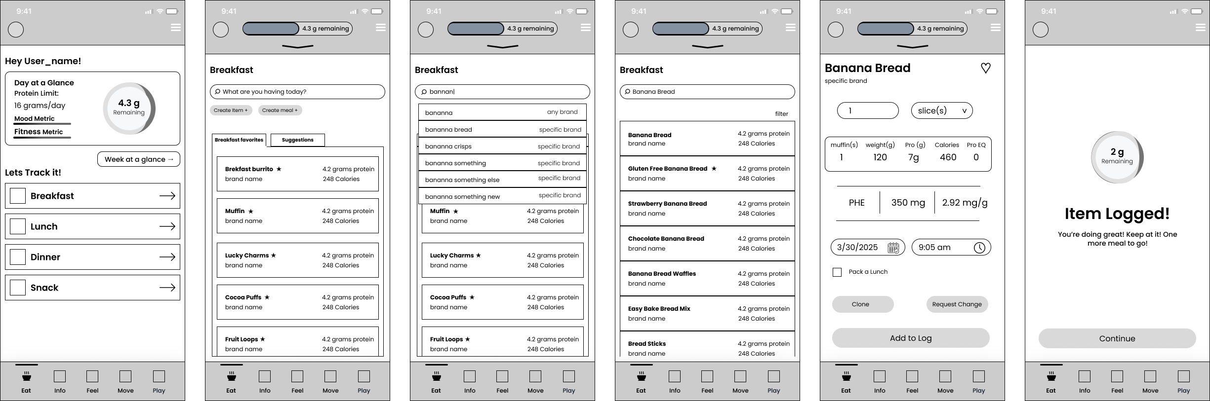
On a single screen, users were asked to search foods, view favorites, access recently logged items, add recipes, create custom foods, and navigate features that were either underused or unreliable. This lack of focus made it easy for users to lose momentum, especially during everyday use when they just wanted to log something quickly.
The issue was not missing functionality. It was too much competing functionality at once.


.png)
.png)
.png)
.png)
.png)