National Weather Service: Validating a Government Website Through Mixed Methods Usability Research
Conceptual Product Redesign
|
UX Research
|
Mobile UX
Usability Testing
Qualitative Research
Quantitative Analysis
Task Success Metrics
Information Architecture
Research Planning
Research Synthesis
Public Sector UX
This project evaluated how people find, understand, and act on critical weather information on a federal public service website. The goal was to assess whether the site structure supported fast, accurate decision making in time sensitive situations. The work combined qualitative usability testing with quantitative performance metrics to identify where users struggled and why.
I worked as part of a four person research team to study first time interactions with the site. The focus stayed on clarity, navigation, and comprehension rather than visual redesign. Findings were synthesized into practical recommendations grounded in observed behavior.
Timeline:
Nov 2024 1 Month
Role:
Team Member — Usability Testing, Data Analysis, Research Synthesis
Team:
Small Team Project
Tools:
Figma, FigJam, Excel, Tableu
Context
Government websites carry a unique responsibility. People rely on them during emergencies, planning decisions, and daily routines. Despite the credibility of the National Weather Service, many users rely on third party tools for faster access to information. This study explored whether usability and structure contributed to that gap.
Research approach
We conducted a mixed methods usability study with 20 participants who regularly check weather information but had no prior experience using the site. Sessions were moderated and followed a consistent task flow while capturing both behavioral observations and performance data.
Methods used
Moderated usability testing using a think aloud protocol
Task based evaluation of core site functions
Quantitative analysis of time on task, task success, and issue frequency
Post task satisfaction ratings using Likert scales
Key tasks
Participants completed three core tasks designed to reflect real world usage
Locate local forecast details
Find historical weather data for a specific date and location
Identify an active weather alert and a related safety action
Findings
Users consistently trusted the accuracy of the information but struggled with access and interpretation.
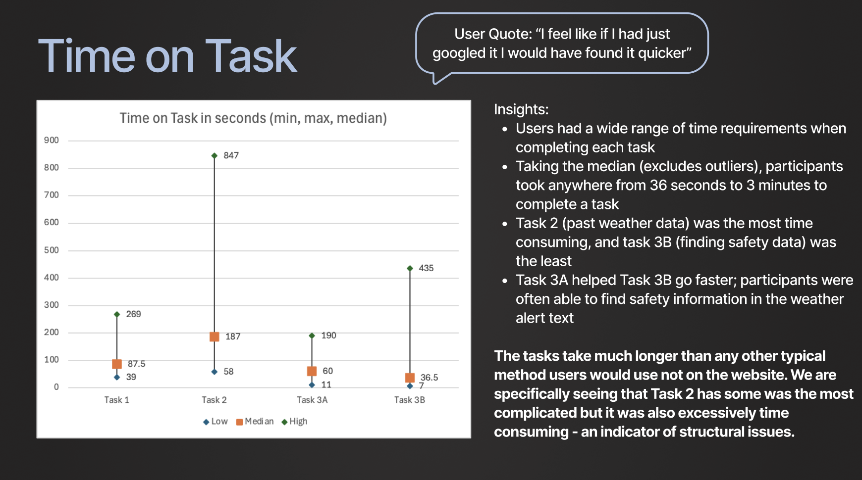
Task completion times ranged from 36 seconds to over 3 minutes
The historical weather task showed a 40 percent failure rate
Navigation loops and deep page nesting caused repeated confusion
Safety information performed better when surfaced directly within alert content
Satisfaction scores fell below expectations for a critical public service tasks designed to reflect real world usage
User experience insights
Qualitative feedback reinforced the quantitative results. Users frequently felt disoriented and unsure where to go next. Visual indicators and terminology lacked clarity for first time users. Several participants stated they would have found answers faster through a general web search, even though they trusted the source itself.
Synthesis
Across 31 unique usability issues, patterns emerged around navigation, hierarchy, and visibility. Most issues related to how information was organized and accessed rather than the quality of the content itself. This pointed to structural design as the primary barrier.
Recommendations
Based on observed patterns, the team proposed structural improvements focused on speed, clarity, and public safety outcomes.
Simplify the primary experience around essential user tasks
Separate general public and expert workflows
Use map first navigation aligned with familiar interaction patterns
Reduce nested page depth to improve wayfinding
Directly link alerts to relevant safety guidance
Outcomes
The research produced a prioritized set of recommendations grounded in both behavioral evidence and performance metrics. The work demonstrated how structural UX decisions directly affect trust, efficiency, and safety in public facing digital systems.
Reflection
This project strengthened my ability to balance qualitative insight with quantitative evidence and synthesize findings into clear direction. It reinforced the importance of designing for clarity and speed when users depend on information to make real world decisions.


.png)
.png)
.png)